

Here's why you should (almost) never use a pie chart for your data
- Written by: Adrian Barnett, Professor of Statistics, Queensland University of Technology
Our lives are becoming increasingly data driven. Our phones monitor our time and internet usage and online surveys discern our opinions and likes. These data harvests are used for telling us how well we’ve slept or what we might like to buy.
Numbers are becoming more important for everyday life, yet people’s numerical skills are falling behind. For example, the percentage of Year 12 schoolchildren in Australia taking higher and intermediate mathematics has been declining for decades.
To help the average person understand big data and numbers, we often use visual summaries, such as pie charts. But while non-numerate folk will avoid numbers, most numerate folk will avoid pie charts. Here’s why.
What is a pie chart?
A pie chart is a circular diagram that represents numerical percentages. The circle is divided into slices, with the size of each slice proportional to the category it represents. It is named because it resembles a sliced pie and can be “served” in many different ways.
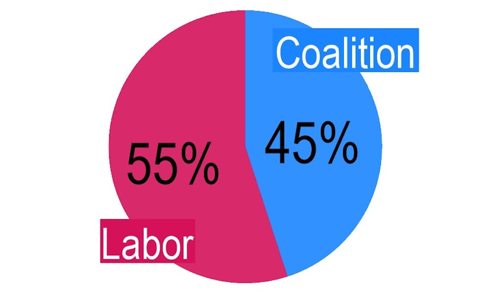
An example pie chart below shows Australia’s two-party preferred vote before the last election, with Labor on 55% and the the Coalition on 45%. The two near semi-circles show the relatively tight race – this is a useful example of a pie chart.
What’s wrong with pie charts?
Once we have more than two categories, pie charts can easily misrepresent percentages and become hard to read.
The three charts below are a good example – it is very hard to work out which of the five areas is the largest. The pie chart’s circularity means the areas lack a common reference point.
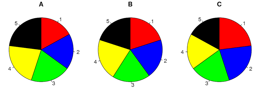 Three example pie charts, each with five similar categories. Can you quickly tell which colour is the largest in each pie?
Schutz/Wikimedia Commons, CC BY
Three example pie charts, each with five similar categories. Can you quickly tell which colour is the largest in each pie?
Schutz/Wikimedia Commons, CC BY
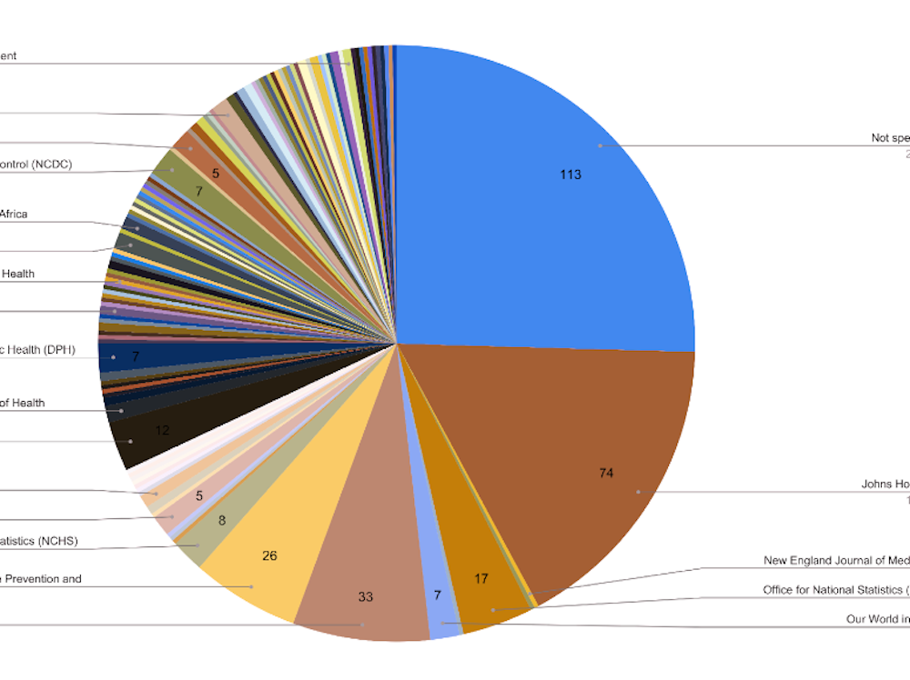
Pie charts also do badly when there are lots of categories. For example, this chart from a study on data sources used for COVID data visualisation shows hundreds of categories in one pie.
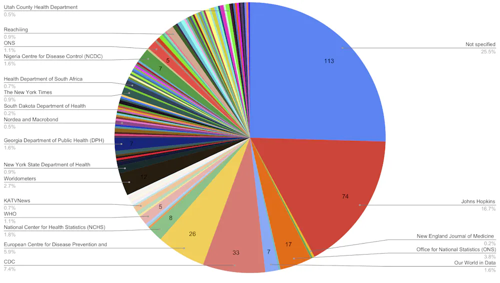 A pie chart with dozens of categories. Not every category has a label, it’s not clear what the total number of categories is and what the unlabelled slices refer to.
Trajkova et al., Informatics (2020), CC BY
A pie chart with dozens of categories. Not every category has a label, it’s not clear what the total number of categories is and what the unlabelled slices refer to.
Trajkova et al., Informatics (2020), CC BY
The tiny slices, lack of clear labelling and the kaleidoscope of colours make interpretation difficult for anyone.
It’s even harder for a colour blind person. For example, this is a simulation of what the above chart would look like to a person with deuteranomaly or reduced sensitivity to green light. This is the most common type of colour blindness, affecting roughly 4.6% of the population.
 The same data chart as above, but run through a simulation filter to demonstrate what it would look like for someone with a common type of colour blindness.
Trajkova et al., Informatics (2020); modified., CC BY
The same data chart as above, but run through a simulation filter to demonstrate what it would look like for someone with a common type of colour blindness.
Trajkova et al., Informatics (2020); modified., CC BY
It can get even worse if we take pie charts and make them three-dimensional. This can lead to egregious misrepresentations of data.
Below, the yellow, red and green areas are all the same size (one-third), but appear to be different based on the angle and which slice is placed at the bottom of the pie.
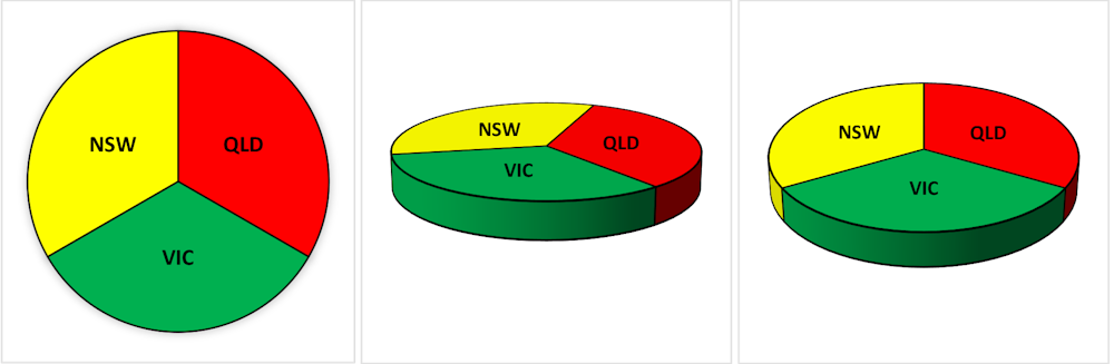 A standard two-dimensional pie chart and two three-dimensional pie charts. In every chart the proportions are one-third but there appear to be differences between states in the three-dimensional versions.
Victor Oguoma, CC BY-ND
A standard two-dimensional pie chart and two three-dimensional pie charts. In every chart the proportions are one-third but there appear to be differences between states in the three-dimensional versions.
Victor Oguoma, CC BY-ND
So why are pie charts everywhere?
Despite the well known problems with pie charts, they are everywhere. They are in journal articles, PhD theses, political polling, books, newspapers and government reports. They’ve even been used by the Australian Bureau of Statistics.
While statisticians have criticised them for decades, it’s hard to argue with this logic: “if pie charts are so bad, why are there so many of them?”
Possibly they are popular because they are popular, which is a circular argument that suits a pie chart.
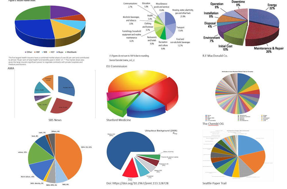 A collection of terrible pie charts gathered from various open access sources, including ‘exploded’ pie charts and 3D pie charts.
Adrian Barnett and Victor Oguoma, CC BY-ND
A collection of terrible pie charts gathered from various open access sources, including ‘exploded’ pie charts and 3D pie charts.
Adrian Barnett and Victor Oguoma, CC BY-ND
What’s a good alternative to pie charts?
There’s a simple fix that can effectively summarise big data in a small space and still allow creative colour schemes.
It’s the humble bar chart. Remember the brain-aching pie chart example above with the five categories? Here’s the same example using bars – we can now instantly see which category is the largest.
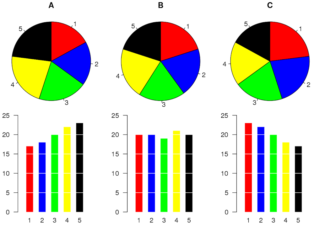 Three pie charts, each with five similar categories, and the same data presented using bar charts.
Schutz/Wikimedia Commons, CC BY
Three pie charts, each with five similar categories, and the same data presented using bar charts.
Schutz/Wikimedia Commons, CC BY
Linear bars are easier on the eye than the non-linear segments of a pie chart. But beware the temptation to make a humble bar chart look more interesting by adding a 3D effect. As you already saw, 3D charts distort perception and make it harder to find a reference point.
Below is a standard bar chart and a 3D alternative of the number of voters in the 1992 US presidential election split by family income (from under US$15K to over $75k). Using the 3D version, can you tell the number of voters for each candidate in the highest income category? Not easily.
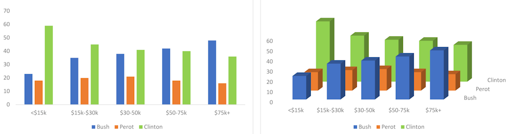 The same voter data presented as a standard two-dimensional bar chart and an unhelpful three-dimensional version.
Victor Oguoma, CC BY-ND
The same voter data presented as a standard two-dimensional bar chart and an unhelpful three-dimensional version.
Victor Oguoma, CC BY-ND
Is it ever okay to use a pie chart?
We’ve shown some of the worst examples of pie charts to make a point. Pie charts can be okay when there are just a few categories and the percentages are dissimilar, for example with one large and one small category.
Overall, it is best to use pie charts sparingly, especially when there is a more “digestible” alternative – the bar chart.
Whenever we see pie charts, we think one of two things: their creators don’t know what they’re doing, or they know what they are doing and are deliberately trying to mislead.
A graphical summary aims to easily and quickly communicate the data. If you feel the need to spruce it up, you’re likely reducing understanding without meaning to do so.
Read more: 3 questions to ask yourself next time you see a graph, chart or map
Authors: Adrian Barnett, Professor of Statistics, Queensland University of Technology
Read more https://theconversation.com/heres-why-you-should-almost-never-use-a-pie-chart-for-your-data-214576
-never-use-a-pie-chart-for-your-data&media=https://www.dailybulletin.com.au/https://images.theconversation.com/files/558554/original/file-20231109-25-j7ehuz.jpg?ixlib=rb-1.1.0&rect=810%2C436%2C4761%2C3377&q=45&auto=format&w=496&fit=clip&description=Here's%20why%20you%20should%20(almost)%20never%20use%20a%20pie%20chart%20for%20your%20data "Pin It")

 Daily Bulletin


