

Scary red or icky green? We can't say what colour coronavirus is and dressing it up might feed fears
- Written by: Simon Weaving, Senior Lecturer, School of Creative Industries, University of Newcastle
Images of the latest coronavirus have become instantly recognisable, often vibrantly coloured and floating in an opaque background. In most representations, the shape of the virus is the same – a spherical particle with spikes, resembling an alien invader.
But there’s little consensus about the colour: images of the virus come in red, orange, blue, yellow, steely or soft green, white with red spikes, red with blue spikes and many colours in between.
In their depictions of the virus, designers, illustrators and communicators are making some highly creative and evocative decisions.
Colour, light and fear
For some, the lack of consensus about the appearance of viruses confirms fears and increases anxiety. On March 8 2020, the director-general of the World Health Organisation warned of the “infodemic” of misinformation about the coronavirus, urging communicators to use “facts not fear” to battle the flood of rumours and myths.
The confusion about the colour of coronavirus starts with the failure to understand the nature of colour in the sub-microscopic world.
Our perception of colour is dependent on the presence of light. White light from the sun is a combination of all the wavelengths of visible light – from violet at one end of the spectrum to red at the other.
When white light hits an object, we see its colour thanks to the light that is reflected by that object towards our eyes. Raspberries and rubies appear red because they absorb most light but reflect the red wavelength.
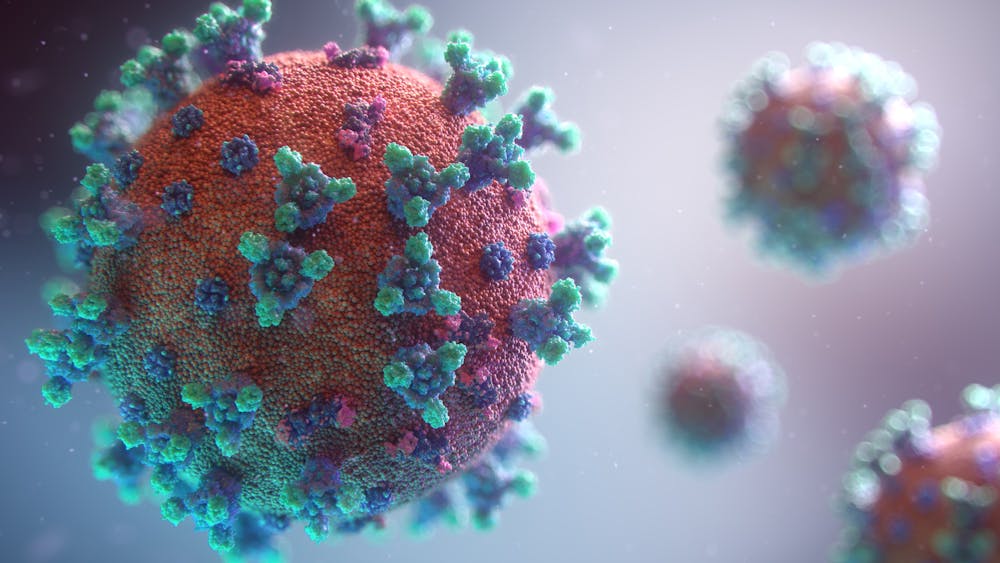 An artist’s impression of the pandemic virus.
Fusion Medical Animation/Unsplash, CC BY
An artist’s impression of the pandemic virus.
Fusion Medical Animation/Unsplash, CC BY
But as objects become smaller, light is no longer an effective tool for seeing. Viruses are so small that, until the 1930s, one of their scientifically recognised properties was their invisibility. Looking for them with a microscope using light is like trying to find an ant in a football stadium at night using a large searchlight: the scale difference between object and tool is too great.
It wasn’t until the development of the electron microscope in the 1930s that researchers could “see” a virus. By using electrons, which are vastly smaller than light particles, it became possible to identify the shapes, structures and textures of viruses. But as no light is involved in this form of seeing, there is no colour. Images of viruses reveal a monochrome world of grey. Like electrons, atoms and quarks, viruses exist in a realm where colour has no meaning.
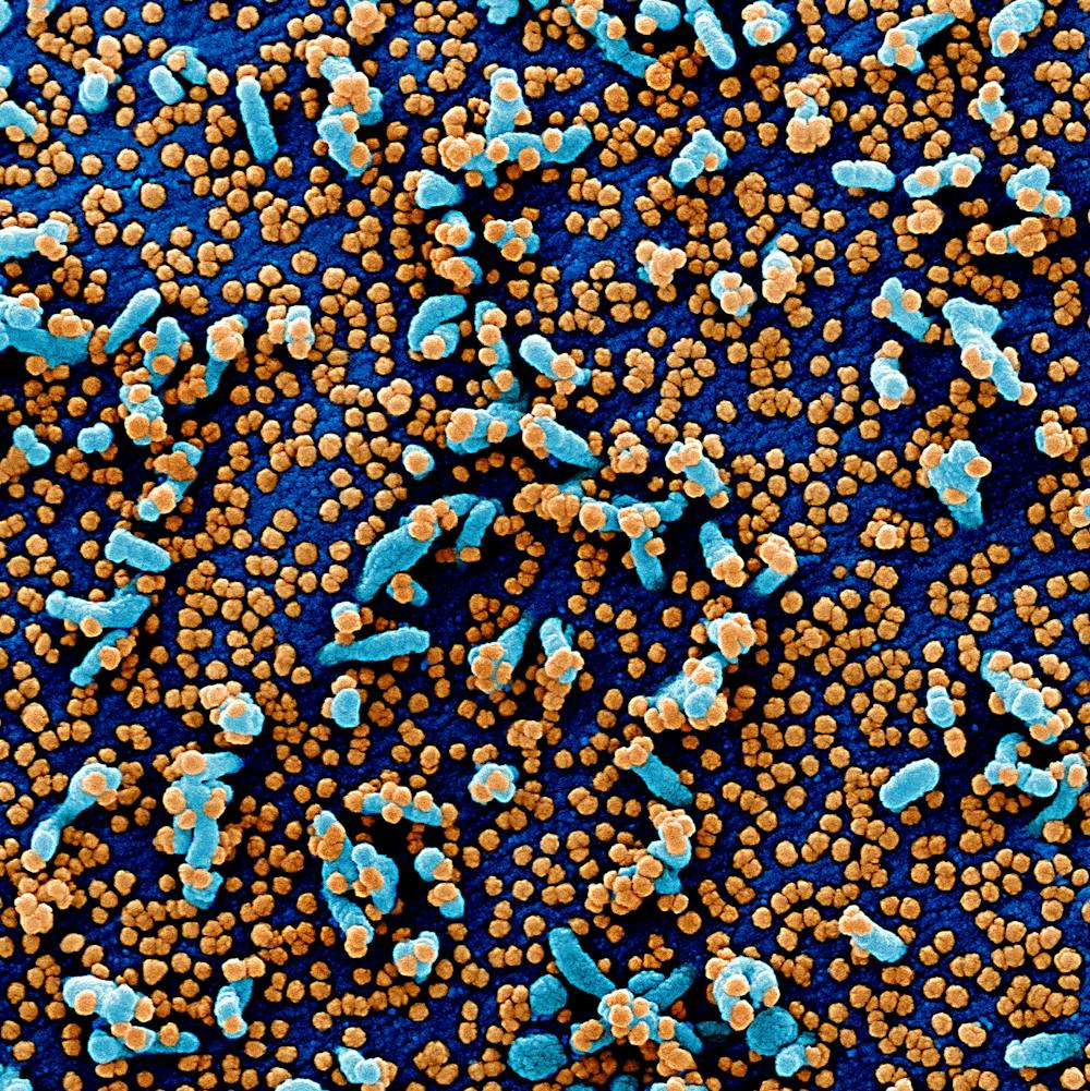 A colorised scanning electron micrograph image of a VERO E6 cell (blue) heavily infected with SARS-COV-2 virus particles (orange), isolated from a patient sample.
NIAID/Flickr, CC BY
A colorised scanning electron micrograph image of a VERO E6 cell (blue) heavily infected with SARS-COV-2 virus particles (orange), isolated from a patient sample.
NIAID/Flickr, CC BY
Vivid imagery
Grey images of unfamiliar blobs don’t make for persuasive or emotive media content.
Research into the representation of the Ebola virus outbreak in 1995 revealed the image of choice was not the worm-like virus but teams of Western medical experts working in African villages in hermetically sealed suits. The early visual representation of the AIDS virus focused on the emaciated bodies of those with the resulting disease, often younger men.
With symptoms similar to the common cold and initial death rates highest amongst the elderly, the coronavirus pandemic provides no such dramatic visual material. To fill this void, the vivid range of colourful images of the coronavirus have strong appeal.
Many images come from stock photo suppliers, typically photorealistic artists’ impressions rather than images from electron microscopes.
The Public Health Library of the US government’s Centre for Disease Control (CDC) provides one such illustration, created to reveal the morphology of the coronavirus. It’s an off-white sphere with yellow protein particles attached and red spikes emerging from the surface, creating the distinctive “corona” or crown. All of these colour choices are creative decisions.
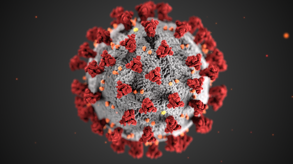 The CDC illustration reveals ‘ultrastructural morphology’ exhibited by coronaviruses.
CDC/Alissa Eckert, MS; Dan Higgins/MAMS
The CDC illustration reveals ‘ultrastructural morphology’ exhibited by coronaviruses.
CDC/Alissa Eckert, MS; Dan Higgins/MAMS
Biologist David Goodsell takes artistic interpretation a step further, using watercolour painting to depict viruses at the cellular level.
One of the complicating challenges for virus visualisation is the emergence of so-called “colour” images from electron microscopes. Using a methodology that was originally described as “painting,” scientists are able to add colour to structures in the grey-scale world of imaging to help distinguish the details of cellular micro-architecture. Yet even here, the choice of colour is arbitrary, as shown in a number of coloured images of the coronavirus made available on Flickr by the National Institute of Allergy and Infectious Diseases (NIAID). In these, the virus has been variously coloured yellow, orange, magenta and blue.
 A composite of images created by NIAID. Colours have been attributed by scientists but these are arbitrary.
NIAID/Flickr, CC BY
A composite of images created by NIAID. Colours have been attributed by scientists but these are arbitrary.
NIAID/Flickr, CC BY
Embracing grey
Whilst these images look aesthetically striking, the arbitrary nature of their colouring does little to solve WHO’s concerns about the insecurity that comes with unclear facts about viruses and disease.
One solution would be to embrace the colourless sub-microscopic world that viruses inhabit and accept their greyness.
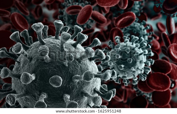
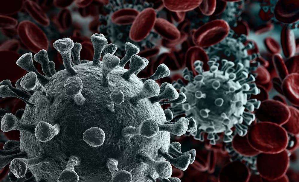 Some artists’ impressions include blood platelet images.
Shutterstock
Some artists’ impressions include blood platelet images.
Shutterstock
This has some distinct advantages: firstly, it fits the science that colour can’t be attributed where light doesn’t reach. Secondly, it renders images of the virus less threatening: without their red spikes or green bodies they seem less like hostile invaders from a science fiction fantasy. And the idea of greyness also fits the scientific notion that viruses are suspended somewhere between the dead and the living.
Stripping the coronavirus of the distracting vibrancy of vivid colour – and seeing it consistently as an inert grey particle – could help reduce community fear and better allow us to continue the enormous collective task of managing its biological and social impact.
Authors: Simon Weaving, Senior Lecturer, School of Creative Industries, University of Newcastle


