

Can I trust this map? 4 questions to ask when you see a map of the coronavirus pandemic
- Written by: Amy Griffin, Senior Lecturer, Geospatial Sciences, RMIT University
Maps have shown us how the events of this disastrous year have played out around the globe, from the Australian bushfires to the spread of the COVID-19 pandemic. But there are good reasons to question the maps we see.
Some of these reasons have been explored recently through maps of the bushfires or those created from satellite images.
Maps often inform our actions, but how do we know which ones are trustworthy? My research shows that answering this question may be critically important for the world’s most urgent challenge: the COVID-19 pandemic.
Read more: Satellite imagery is revolutionizing the world. But should we always trust what we see?
Why are trustworthy maps important?
Maps guide decisions, including those made by governments, private companies, and individual citizens. During the pandemic, government restrictions on activities to protect public health have been strongly informed by maps.
Governments rely on public cooperation with the restrictions, and they have used maps to explain the situation and build trust. If people don’t trust information from the government, they may be less likely to comply with the restrictions.
This highlights the importance of trustworthy COVID-19 maps. Maps can be untrustworthy when they don’t show the most relevant or timely information or because they show information in a misleading way.
Below are a few question you should ask yourself to work out whether you should trust a map you read.
What information is being mapped?
The number of cases of COVID-19 is an important piece of information. But that number could just reflect how many people are being tested. If you don’t know how much testing is being done, you can misjudge the level of risk.
Low case numbers might mean that there isn’t much testing being done. If the percentage of positive cases (positive test rate) is high, we might be missing cases. So not accounting for the number of tests can be misleading.
The World Health Organization suggests that at least ten negative tests to one positive test, a positive test rate of at most 10%, is the lowest rate of testing that is adequate.
In Australia, we have been at the forefront of making sure we are doing enough testing and we are confident that we are identifying most of the cases. Undertesting has been a problem in some other countries.
How is the information being mapped?
It’s not just the numbers that matter. How the numbers are shown is also important so that map readers get an accurate picture of what we know.
The Victorian Government recently advised Melburnians to avoid travel to and from several local council areas because of high case numbers. But their publicly available map does not show this clearly.
Compare the government-produced map with a map of the same data mapped differently. Most people interpret light as few cases and dark as more cases. The government-produced map uses dark colours for both low and high numbers of cases.
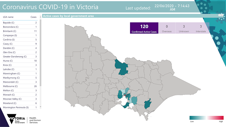 Active COVID-19 Cases in Victoria, 22 June 2020, ©State of Victoria 2020.
Victorian Government Department of Health and Human Services
Active COVID-19 Cases in Victoria, 22 June 2020, ©State of Victoria 2020.
Victorian Government Department of Health and Human Services
Who made this map and why did they make it?
Maps can inform, misinform, and disinform, like any other information source. So it is important to pay attention to the map’s context as well as the author.
Viral maps are maps that spread quickly and widely, often via social media. Viral maps cannot always be trusted, even when they come from a reputable source. Maps that are trustworthy in one context may not be in another.
An example from Australian news media in February shows this. Several media outlets showed a map that was tweeted by UK researchers. The tweet announced the publication of their new paper about COVID-19.
The media reported the map showed locations to which COVID-19 had spread from Wuhan, China, the origin of the outbreak. It actually depicted airline flight routes, and was used in the tweet to illustrate how globally linked the world is. The map was from a 2012 study not the 2020 study.
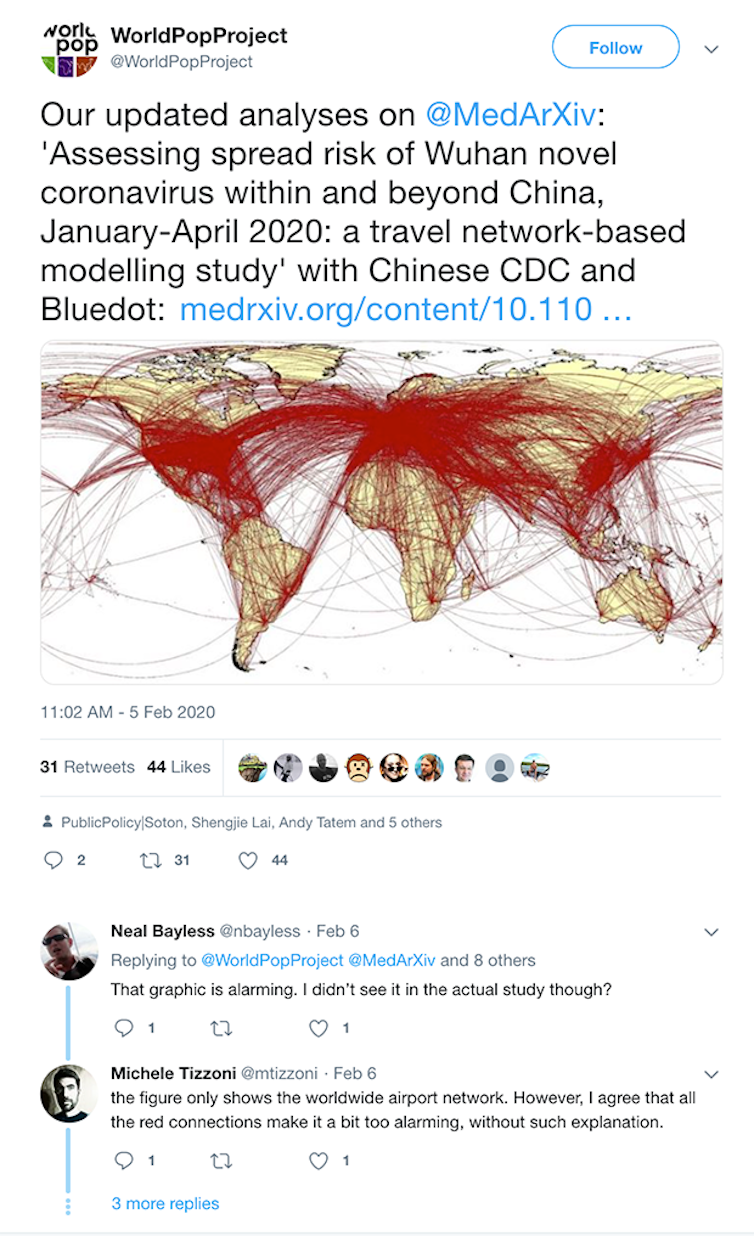 Original tweeted map that went viral and was picked up by many news outlets, © WorldPopProject.
WorldPopProject, archived on the Wayback Machine
Original tweeted map that went viral and was picked up by many news outlets, © WorldPopProject.
WorldPopProject, archived on the Wayback Machine
Many readers may have trusted that reporting because their justifiable anxiety about COVID-19 was reinforced by the map’s design choices. The mass of overlapping red symbols creates a powerful and alarming impression.
While the lines in the map indicate potential routes for virus spread, it doesn’t provide evidence that the did virus spread along all of these routes. The researchers didn’t claim that it did. But without understanding why the map was made and what it showed, several media outlets reported it inaccurately.
Maps on social media are especially likely to be missing important context and explanation. The airline route map was re-shared many times as in the tweet below, often without any source information, making it hard to check its trustworthiness.
Limiting the damage done by COVID-19 is a very substantial challenge. Maps can help ordinary citizens to work together with governments to achieve that outcome. But they need to be made and read with care. Ask yourself what is being mapped, how it’s being mapped, who made the map and why they made it.
Authors: Amy Griffin, Senior Lecturer, Geospatial Sciences, RMIT University


 Daily Bulletin


